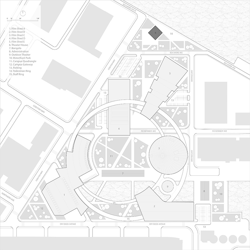
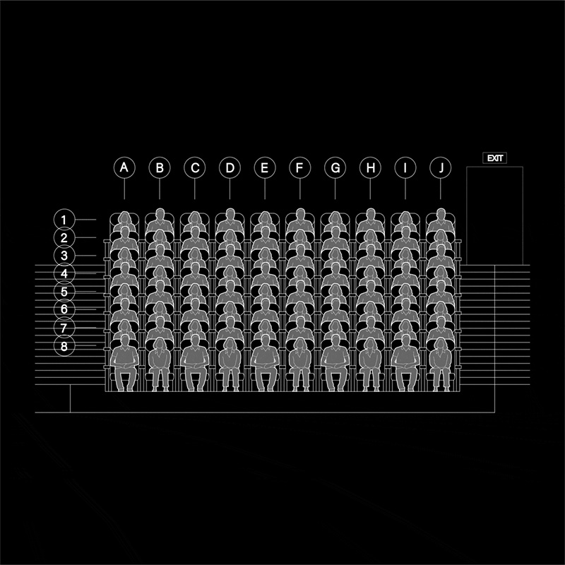
The Picture Palace is the third and last design project of CORE II studio. Throughout this semester, we worked collectively on a film studio campus development by the Boston Seaport District.
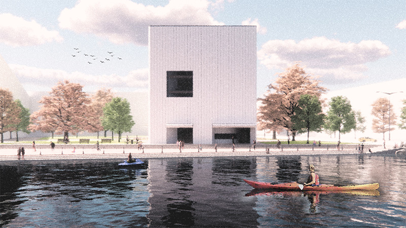
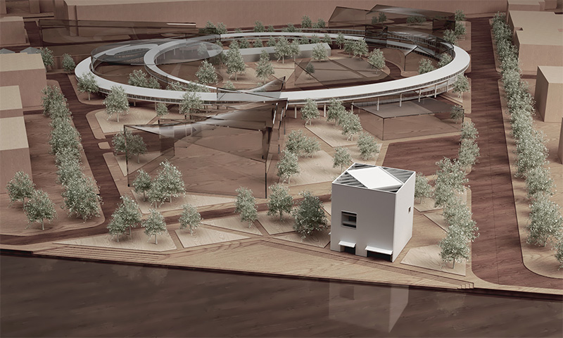
The proposed theater shares the same site we designed previously and situates itself by the shore. It is integrated as part of a waterfront park to accommodate public visitors as well as campus crews.
Design Concept
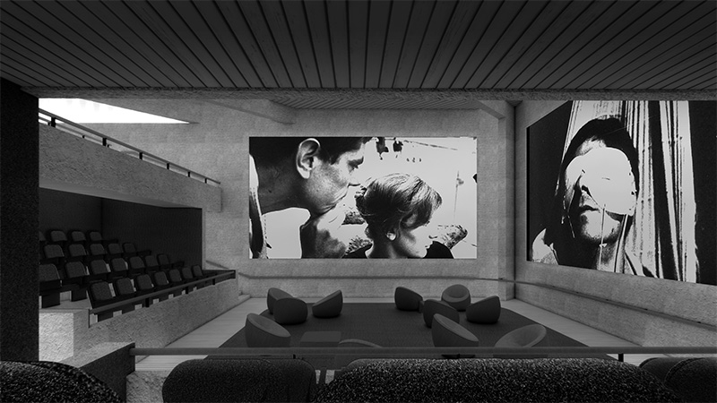
The project challenges orthodox theater design by incorporating common distractions found during film as part of the film, as a result the muted theater spaces are “de-stressed” and “unboxed” to offer new relationships between audience and the media.
Opposing the common perception as a place for relaxation and leisure, movie theaters are among the most disciplined and ruled destinations of your weekend. Many theaters fail to deal with the duality between collective pursuit and individual comfort, when often the quality of hermetic experience is achieved at the cost of suppressing the audience’s right of stretching, reacting, commenting, or moving. As a result any mundane behavior from audiences can be easily rendered as disturbance to others, leading to the accumulation of tension and distress.
* Masterplan collaborated with: JIyoon Lee, Tosin Odugbemi, Courtney Sohn, Aaron Smithson. Teaching Fellow: Brayton Gregory
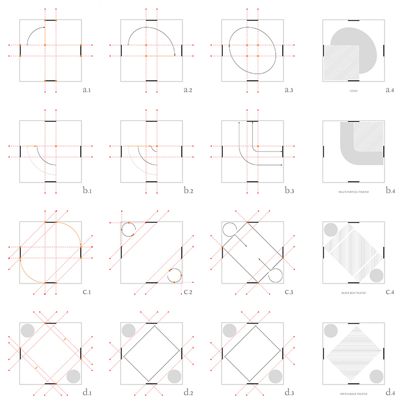
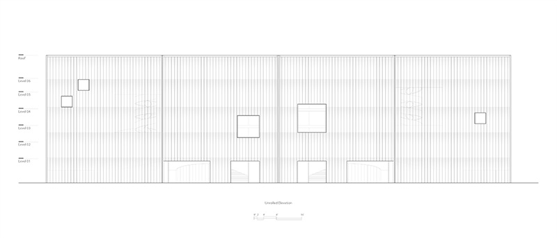
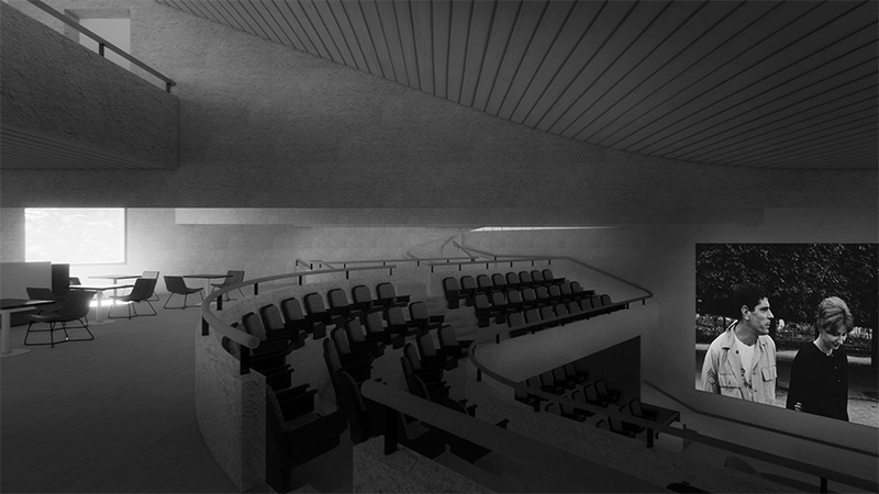
The proposed theater demonstrates a counter-narrative of typical black box theaters and tries to acknowledge the presence of the crowd. A muted facade casts a sharp contrast with the energy and dynamism within. Inside the theater boundaries among different programs are blurred and the entire building registers itself as a singular space as opposed to collection of boxes. Spatial division follows the journey of exploration of the building, visitors are unleashed from a fixed seat and can feel comfortably lost in the film’s narrative while wandering inside the picture palace.
Space Planning
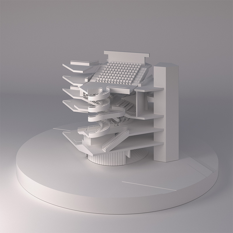
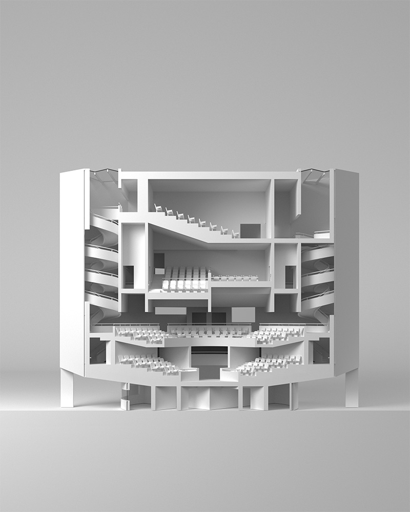
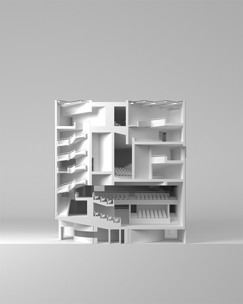
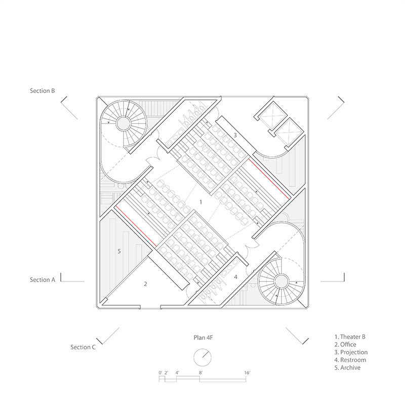
A total of three theaters, each containing an uncanny and distinct experience, are stacked to generate the building’s overall massing. By minimizing the footprint of the picture palace, the natural landscape is preserved as part of the waterfront park.
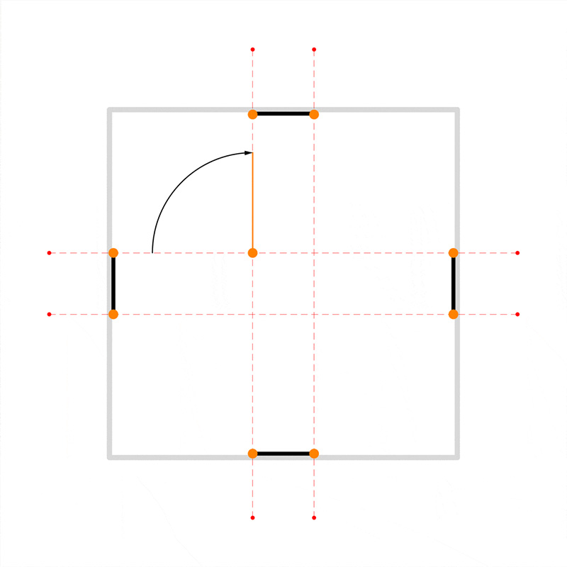
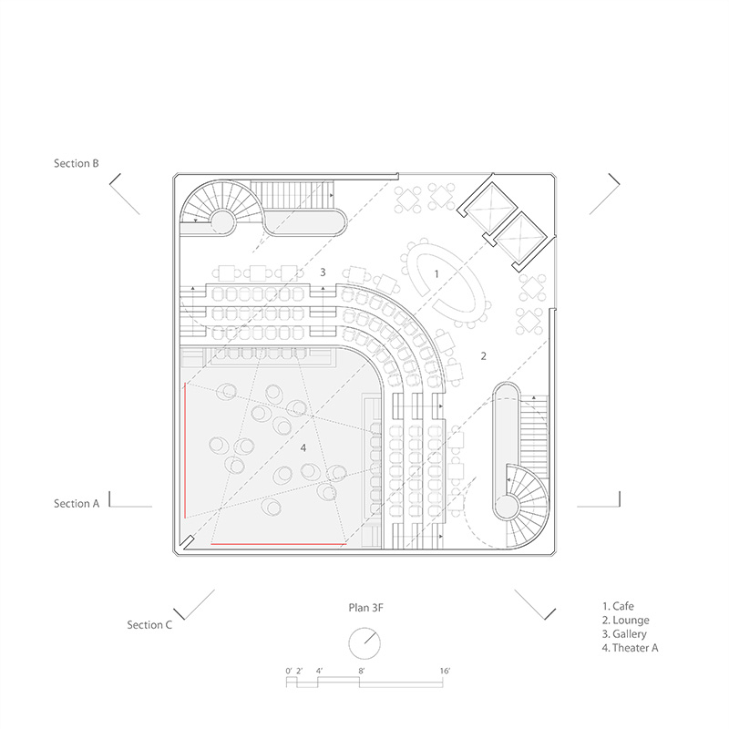
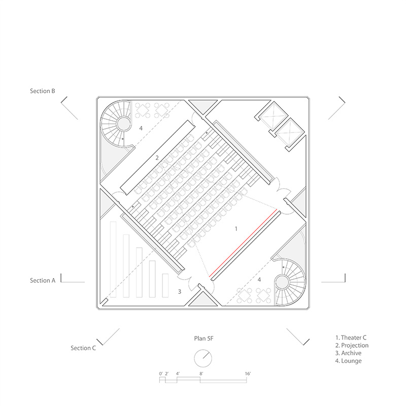
Interior planning follows a strict figure to figure relationship. Served by a pair of vertical circulation; the three theaters negotiate themself within the 70 ft square boundary at each level. Both orthogonal and diagonal grids shuffle throughout the building; as each theater mediates between square and diamond figures, heterogeneous spatial experiences are generated, in the meantime allowing back of house programs to populate in between core and shell.
Hierarchy & Order
Circulatory and stationary programs are closely intertwined upon entering the building and start to gradually untangle as the visitor ascends. The sectional hierarchy is evident as the most radical theaters are situated on bottom, and by contrast a conventional one on top.
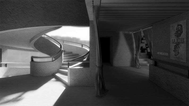
Light serves as the index for direction, when the brightness leads to the passage, and darkness is reserved to conceal mystery and adventures. A series of foyers nest between light and dark.These thresholds mediate between theaters and staircase shafts, helping to refresh the visitor’s sensation as they maneuver through their journey.
Context
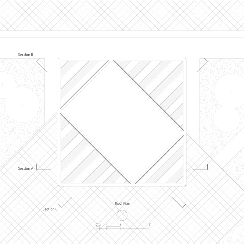
A south facing one looking back at the campus, and the north facing plaza open to the harbor with stepings touching down to the water….the park is a perfect location to host food trucks and vendors, activating the entire region as the recreation hub where interaction among the public visitors and the film crews are facilitated.
The humble formal gesture serves as a decoy when radical theatrical space is concealed within, leading to the generation of uncanny and unexpected experience.

