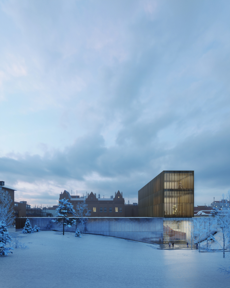
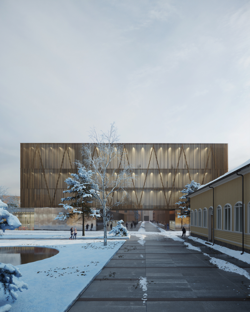
The new Sara Hildén museum will be the symbol of the Finlayson area rehabilitation process. It stands
as a landmark, and it acts as a catalyst for multiple experiences. It’s a project that seeks elegance
without losing a strong touch: it is massive, it is bold, and it is immediately recognizable. It strives to
reach the beauty of the works of art that it will host after its completion while still paying a tribute to
the memory of an illuminated and incredible woman.
Analysis Strategy
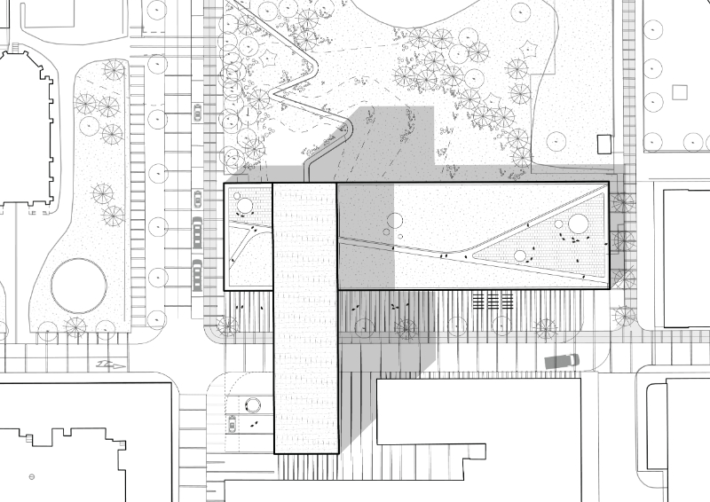
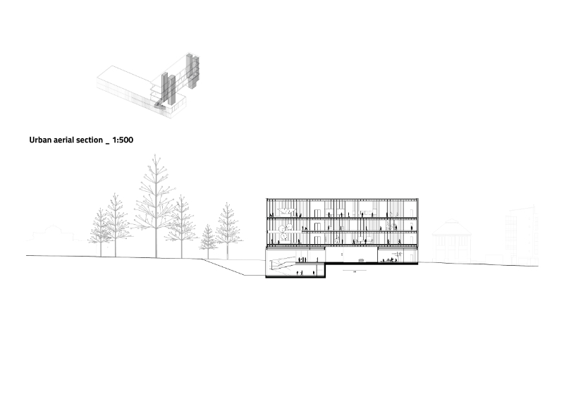
The architectural project sets at the center of a broader and more complex landscape project. This
strategy enhances the connection between the museum and the city. The whole area has a different
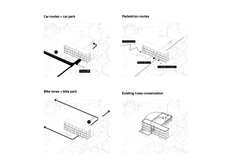
striped pavement that underlines the exceptionality of the museum function placed there. Finlayson
street acts as the principal access to the building while the neighboring streets merge into the existing
mobility strategy that will unfold during the very next years. The urban quality of the proposal is finally
crystallized by a smooth ground recess that enables Wilhelm von Nottbeck Park to penetrate inside
the building, giving quality to the indoor space and strength to the whole urban concept.
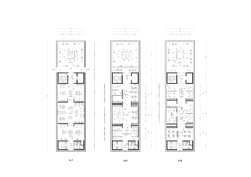
Form and functions
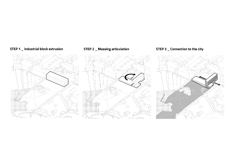
The DNA of the museum is rooted in the industrial legacy of the plot, and so does its plucky shape. The
formal exercise that gave birth to its final configuration starts from the extrusion of a typical old
warehouse block that is then twisted to arrange it into something unexpected, something brave, and
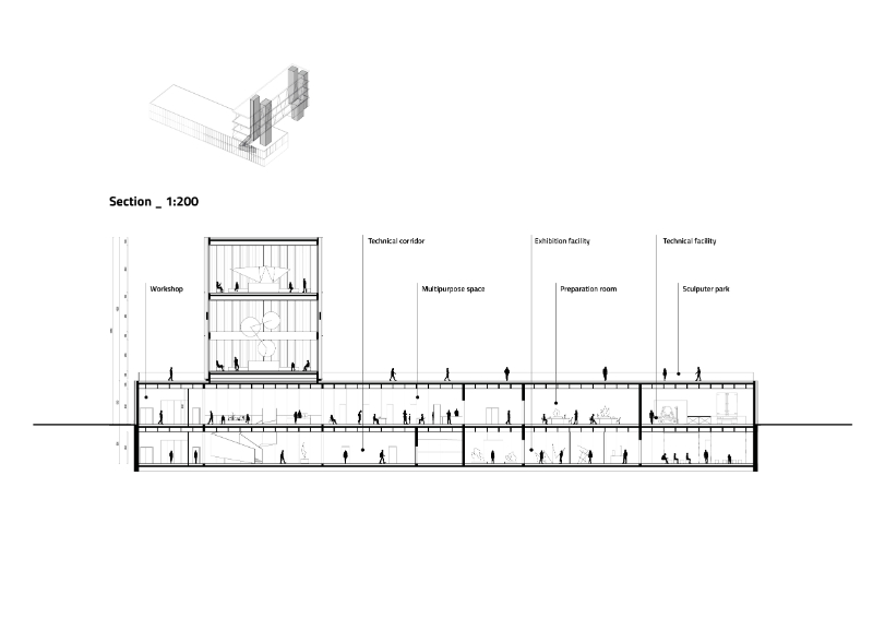
something with a strong identity. What originally was only horizontal, split into two pure geometry: a
low-rise part in contact with the context and the origins of the city and a high-rise part, an allegorical
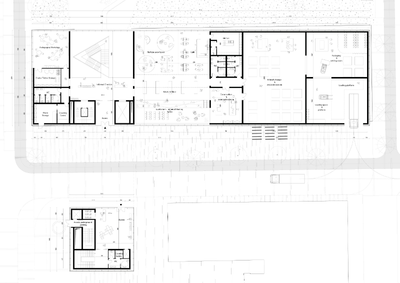
eye that fiery looks at Tampere’s future development. The first section hosts the building’s core
technical functions. They are placed on the ground floor to make them easily accessible and more
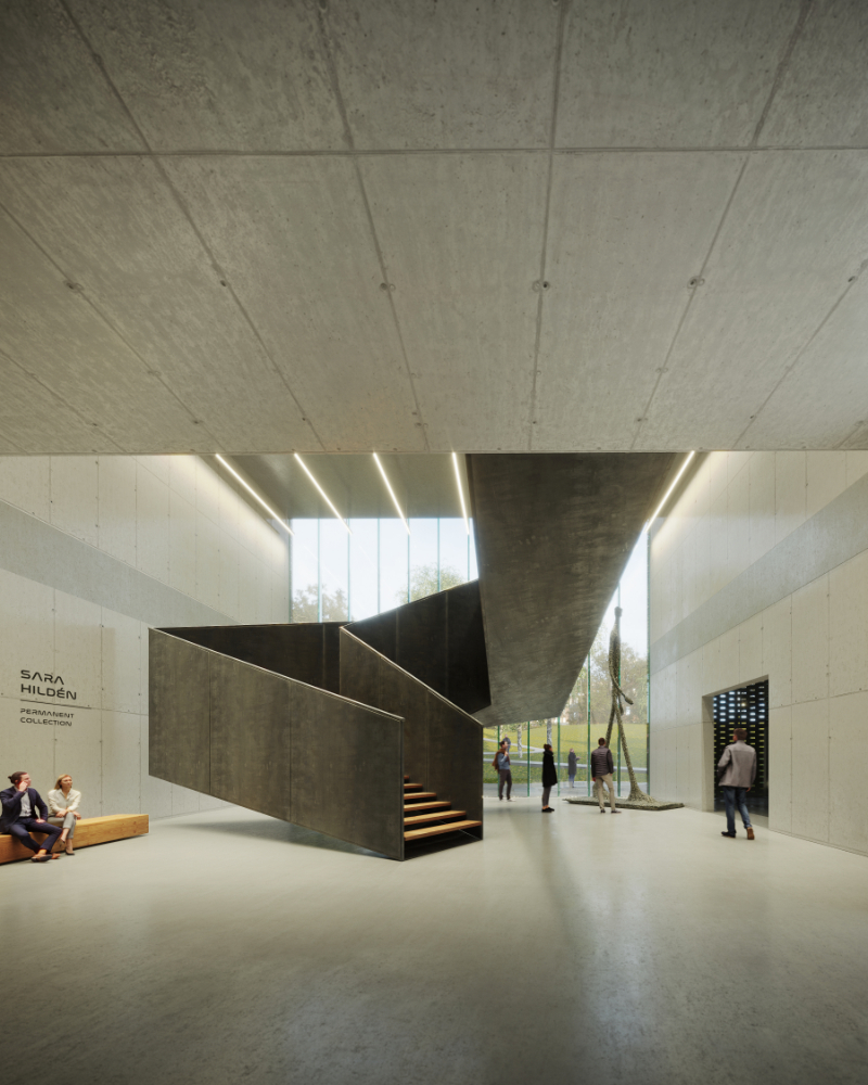
efficient. The access is protected by the cantilever: visitors are welcomed by an informal check-in area
and a scenographic staircase that connects the entrance with the foyer. The underground is just
partially hypogeum: here we can find a big chunk of the exhibition facilities, the ones that will ideally
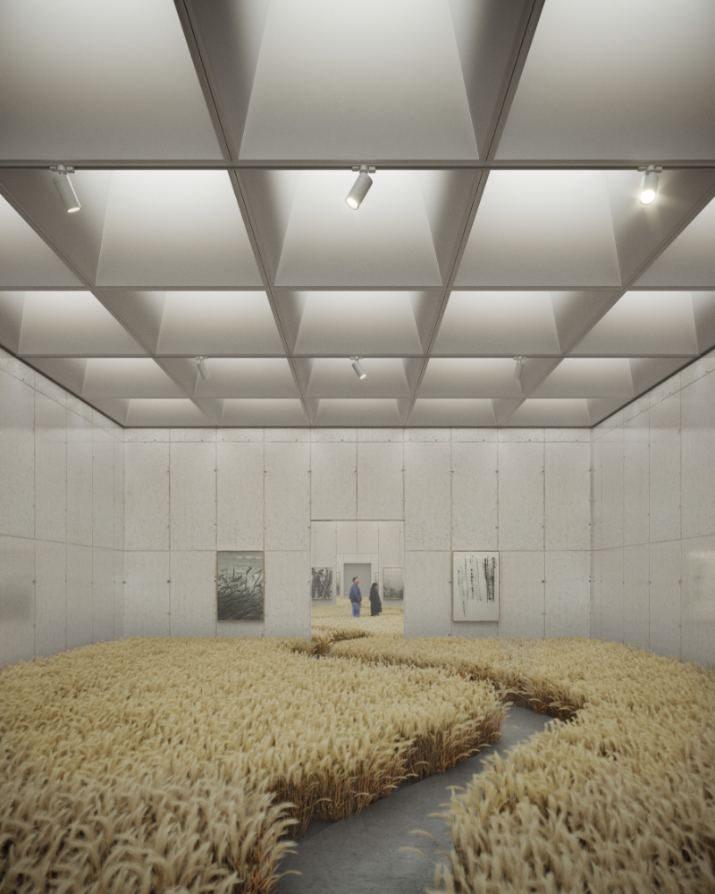
host Sara Hildén’s permanent collection. The temporary collection will be placed in the second taller
section. This part of the building is the most iconic one: thanks to its height, the visitors can benefit
from an unobstructed view towards Tampere’s beautiful landscape while enjoying the biggest works of
art which are placed here because of the more generous net height of the ceilings.
Identity
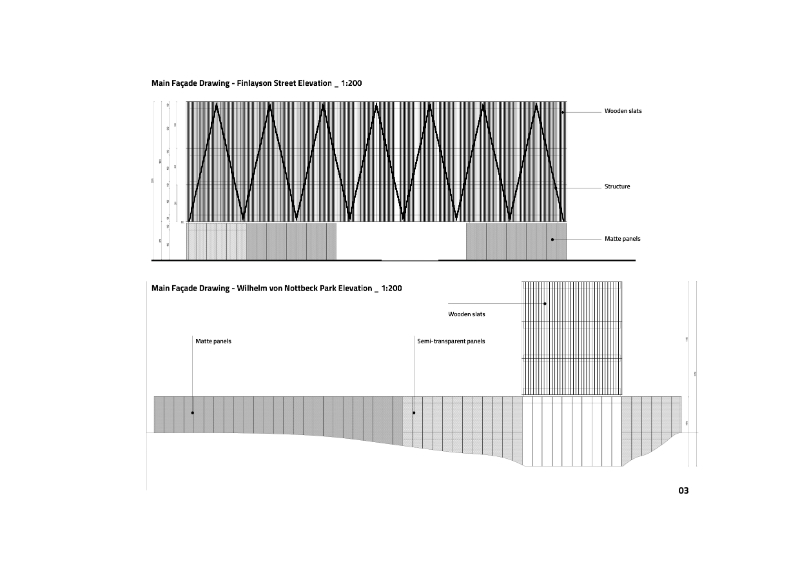
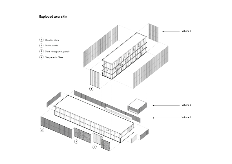
The identity of the building is split as its masses. The lower floor is divided into three different layers of
transparency. The accesses and the foyer’s windows are as glazed and transparent as possible: they
suggest permeability and they open the museum to the city and the landscape. Parts of the workshop
and the exhibition facilities are covered with a perforated metal layer that provides control over the
access of the natural light and acts as a transition material between the more opaque and the more
transparent parts of the building. The technical facilities finishing is made up of reflective sheets that
help the building to elegantly merge into the context. The strong lines of the structural system that
allows the upper floors to fly over Finlayson street characterize the identity of the whole look of the
museum. The last material that needs to be described is the system of wooden slats that covers the
last façades: it provides control over the natural light while giving a unique and warm feeling to the
whole building.
Conclusion
S.H.E. is a new part of Tampere’s skyline. S.H.E. respect the contexts while at the same time breaking
the mould of the consolidated city. S.H.E. is an efficient machine that provides shelter to artworks and
experiences to people. S.H.E. is an impressive, high-quality and impressive architecture solution.
S.H.E. is not just a museum, S.H.E. is an icon.

