Intention
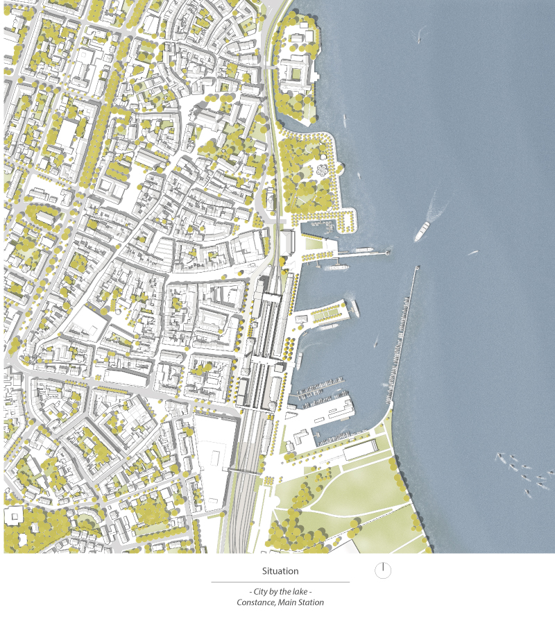
“Constance – city by the lake“ – This is the advertising slogan with which the largest city on Lake Constance attracts attention. But since the railroad station was built directly at the harbor in 1863, the railroad tracks have separated the medieval city center from the lakeshore.
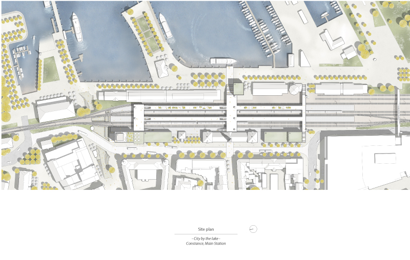
Only a few crossings connect the alleys of the old town with the promenade and the ship piers. In addition, the listed entrance building by Friedrich Eisenlohr no longer meets the requirements of a modern station. Therefore, the city of Constance has decided to enhance the station area. The goal of this redesign is to complement the existing connections between the city and the lake, to expand the area with new buildings and to link the various bus, train and boat stops in order to form a transfer point.
From its separating function, an expressive city entrance is to develop as an interface between the city and the lake, which meets the requirements of the 21st century traffic.
Concept
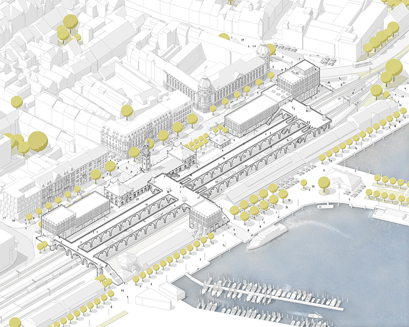
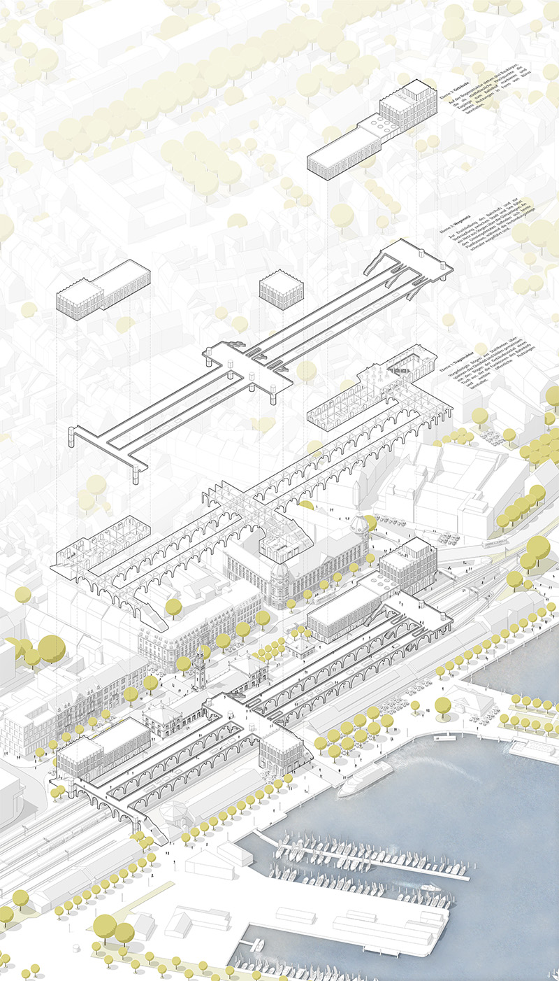
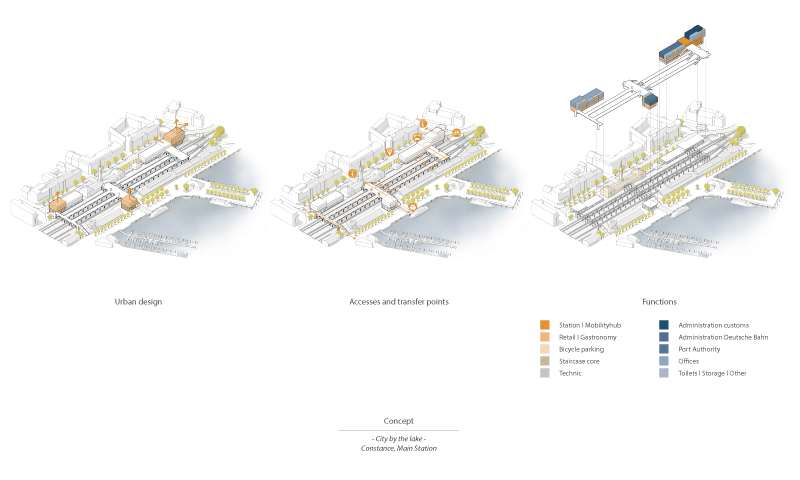
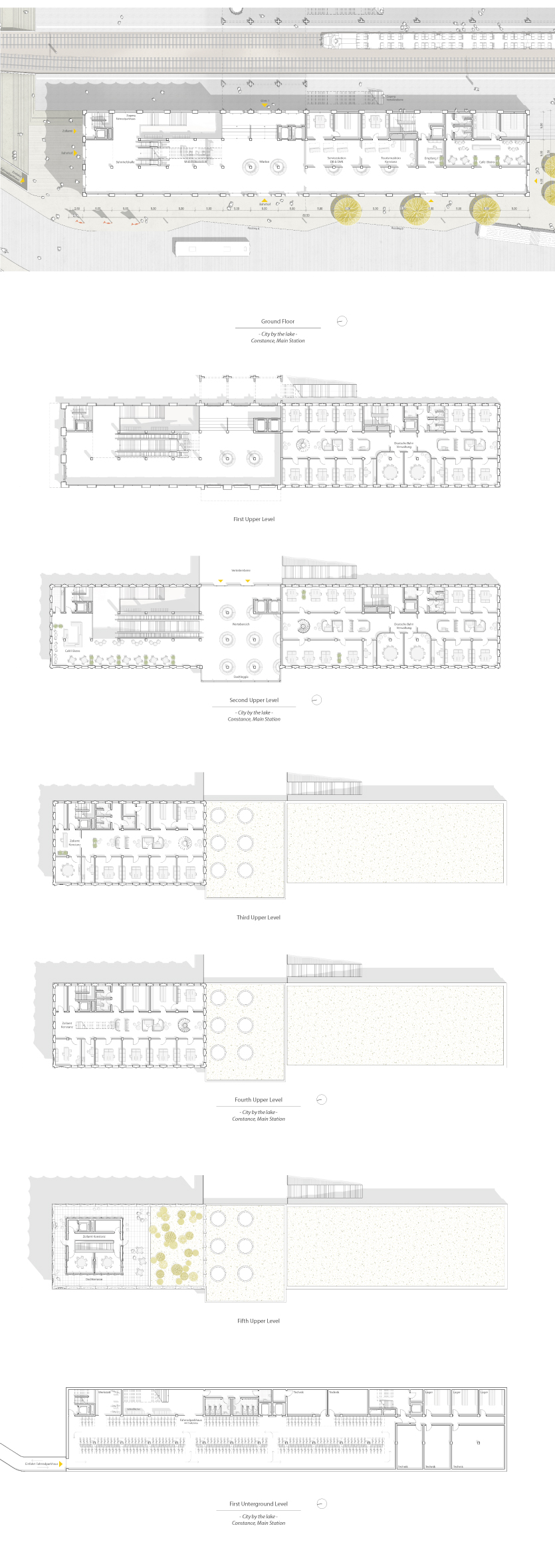
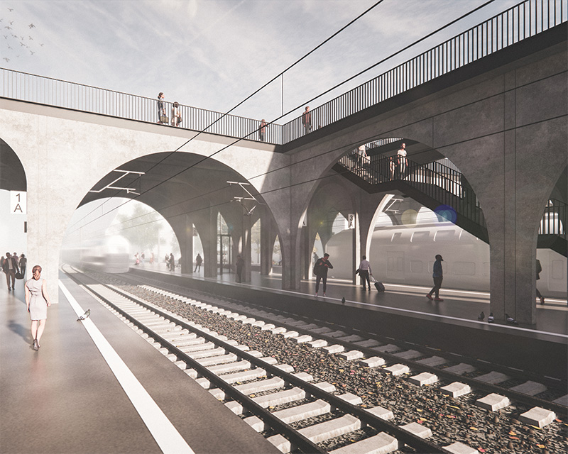
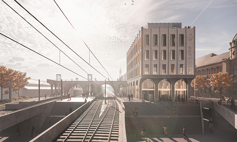
In response to this goal, this conceptual design forms a structure consisting of concrete arches, which stands like a „table“ above the tracks and platforms and organizes the entire area. In this way, the three supplementary volumes – the new entrance building at the marketplace and the two buildings at the pier and at the southern end of the site – will be connected to each other and linked to the surrounding areas.
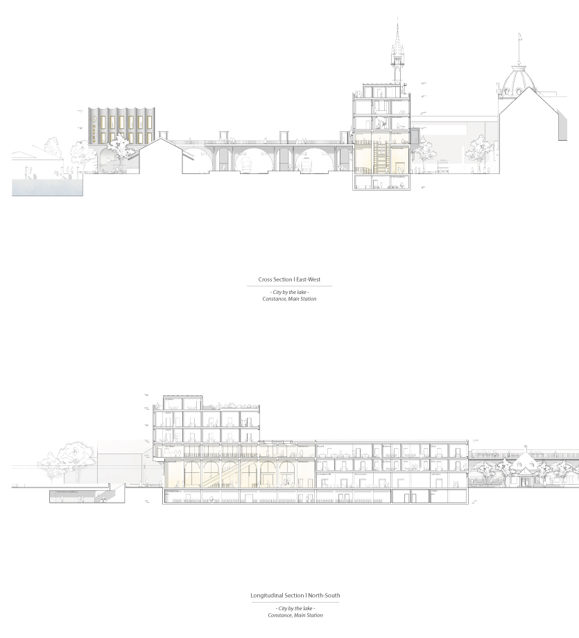
The plinth of the buildings and the supporting structure merge into a single unity that accommodates the functions of the station as well as other public uses. Above the arch structure the distribution level is located, consisting of wide platforms at the transfer points and narrow connecting walkways. Travelers can reach the tracks, the bus station or the catamaran pier directly from the platforms. Visitors and residents can use these walkways to get from the city to the lake more easily. Furthermore, this upper level offers a panoramic view of the city‘s rooftops and the expanse of Lake Constance.
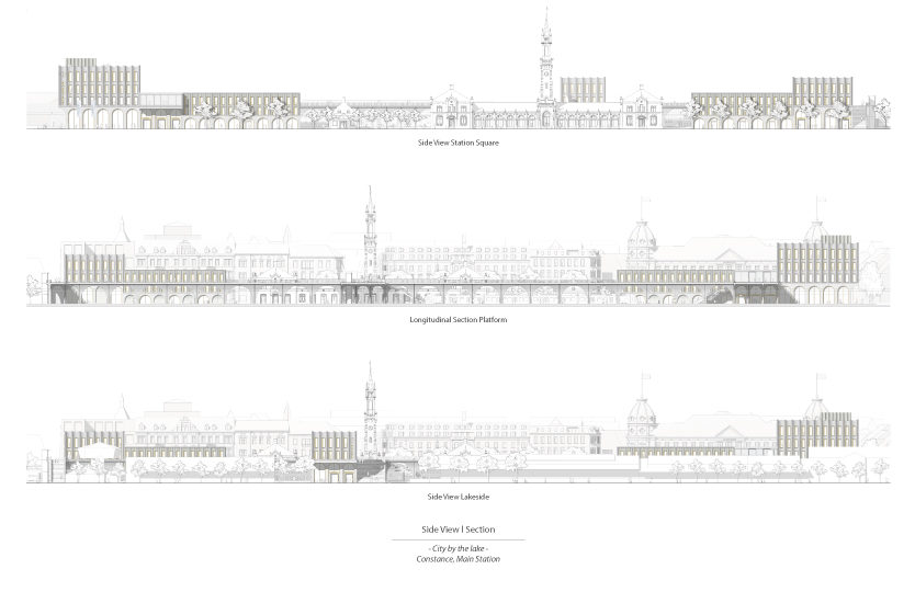
Above the building bases additional uses, like the customs office, the administration of the Deutsche Bahn and other office structures are situated. This building configuration creates three prominent high points that define the area in terms of urban development and emphasize the main accesses to the train station through ledges.
Despite the size of the overall structure, the use of classical architectural elements and color-coordinated materials allows it to blend into the historical context of Constance‘s city center and create a place that connects the city and the lake. Whether arriving in Constance by train or by ship – the train station is the city‘s calling card.
Elements of station architecture – historical references
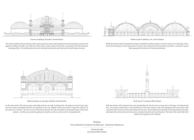
Inspired by the historical context of Constance‘s old town and the station‘s historicist entrance building, which was completed in 1863, this design deals with the beginnings of station architecture. After all, the new station is intended to blend in carefully with the existing buildings while preserving the medieval city skyline that has shaped the face of Constance for decades. The combination of old and new ensures an overall unified appearance of the station emerge, which enhances the lakeside and generates a dialogue with its characteristic surroundings as well as the exciting history of station architecture.
When the train station appeared as a building typology in the early 1830s, architects were faced with the challenge of developing a distinct character for transportation buildings. Due to some important pioneers of railroad station architecture, mainly from England, France and Germany, stations emerged as landmarks of the 19th century. Over just 50 years, four architectural elements defined a railroad station and made it recognizable as such. In order to transfer the character of earlier train stations into today‘s world, these four elements serve as the basis of the design and appear in reinterpreted form.
Design
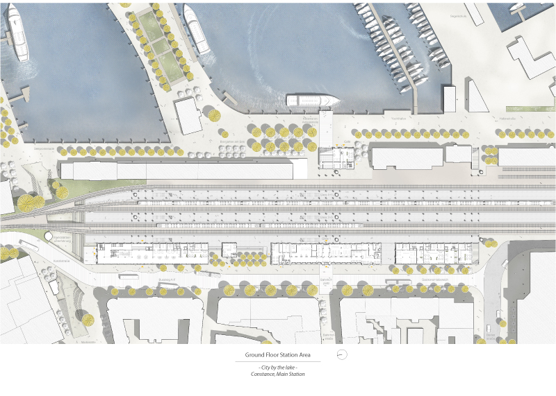
The whole station area is characterized by the new arch structure that spans over the tracks and platforms. In order to create a consistent appearance of the „table“, the materiality concrete of the supporting arch structure extends to the plinth of the buildings. Concurrently, the building base has different heights.
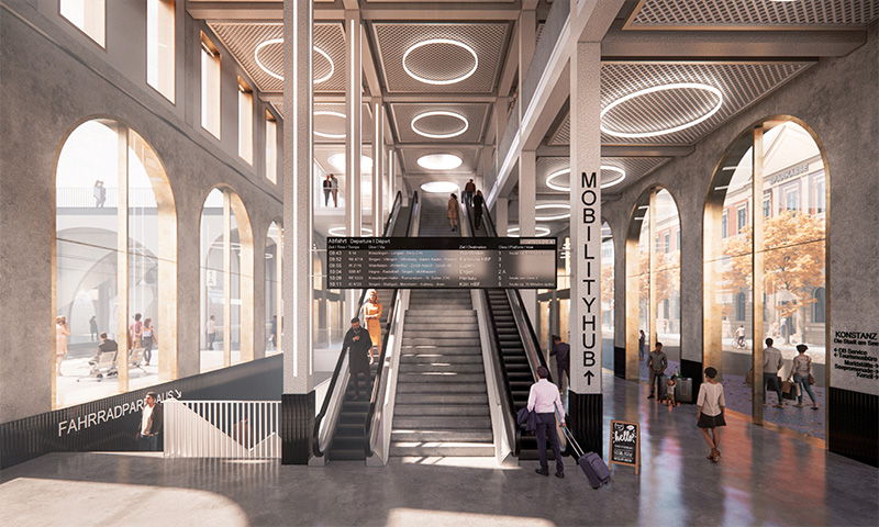
Thus, the area of the entrance hall has a two-story height and connects to the structure of the platforms, while a single-story plinth dominates in the area of the retail and restaurant uses. This change in scale in the room height thus allows the station functions to be clearly read from the inside and outside.
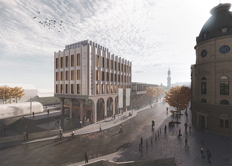
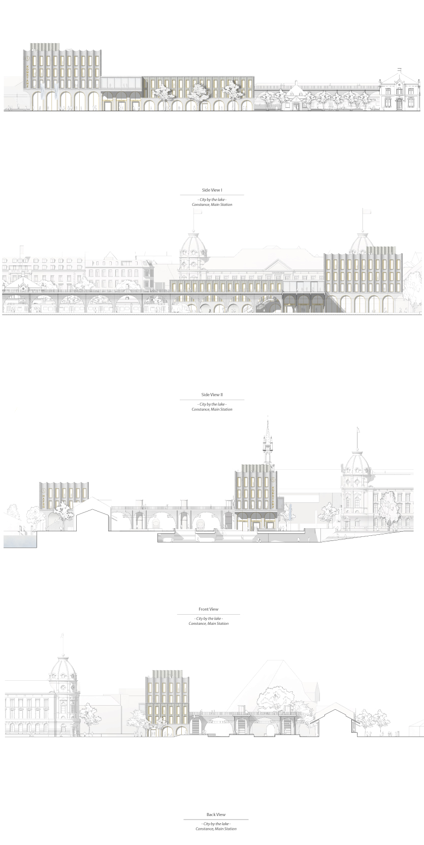
The entrances to the station are marked by ledges at the front and long sides of the building, so that on the one hand a canopy is functionally formed and on the other hand the entrance is visible to travelers from afar.
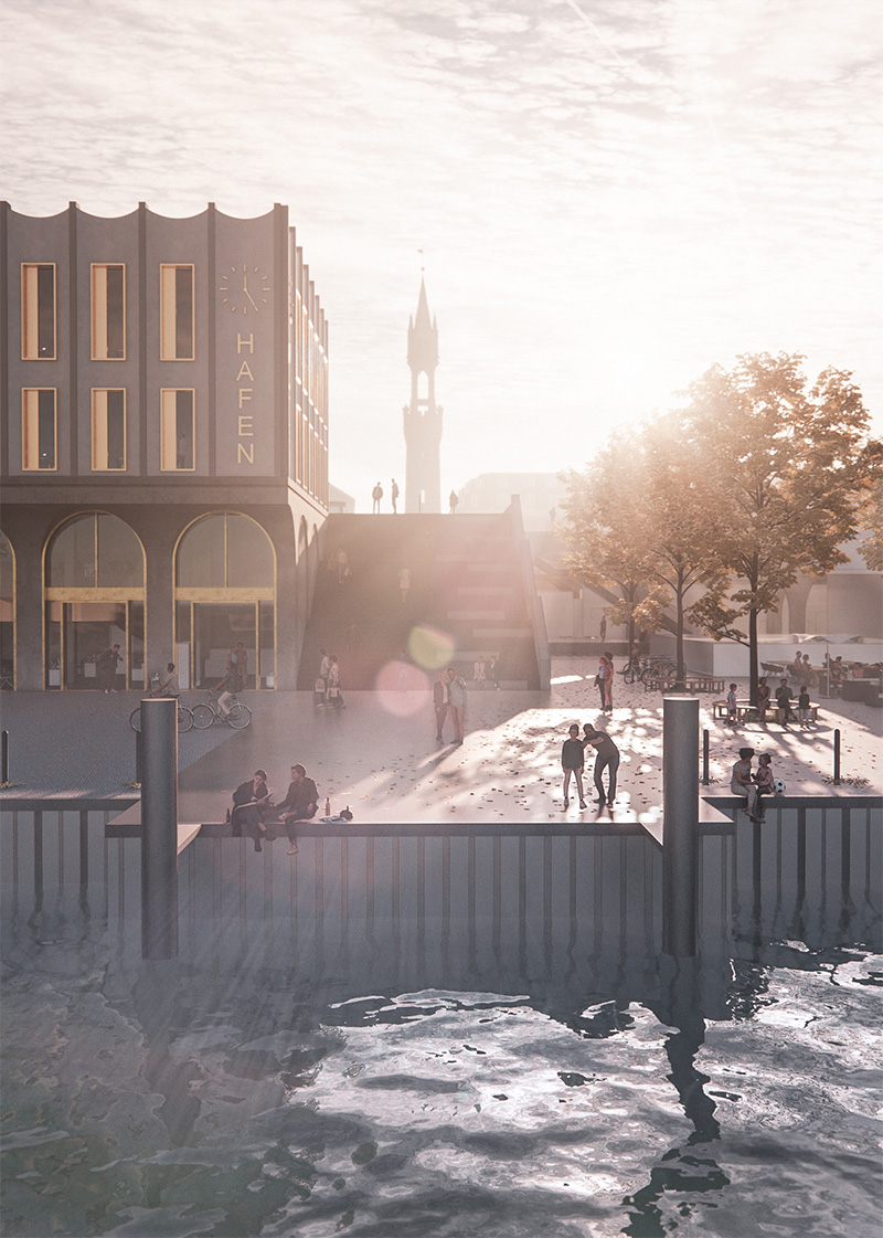
Further elements to emphasize the entrances and to give the station area a consistent identity on all sides are the station lettering and the large clock at the corners of the building of the marketplace and at the harbor.
Materiality
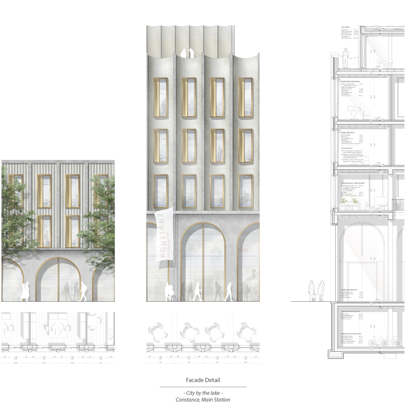
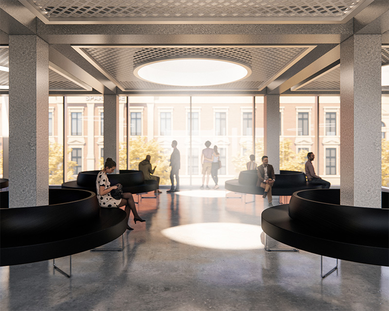
Above the arches of the plinth, the glass gap of the waiting area pushes out of the building volume to form a loggia. This divides the 80-meter-long structure into a flatter longitudinal building and a higher building volume that serves as a prominent high point marking the main entrance to the station at the marketplace. The facade of the higher volume has a vertical structure, which is emphasized by pilaster strips and high-format windows.
At the same time, the various facade fields, which consist of ground and polished prefabricated concrete elements, are concavely curved and create an elegant appearance due to the reflections of the shiny concrete. The facade flaring out towards the top and the wave-shaped end forms a figurative crown which emphasizes the urban high points not only through their volume but also through the facade design.
The fluting of the facade of the longitudinal building forms a contrast to the smooth structure of the concavely curved facade fields. Due to the smaller-scale formulation and rougher haptics of the facade, the length of the building is visually broken up.
Thus, while the two surface textures contrast with each other, the same facade division and materiality creates a unity. The interaction of the polished concrete and the golden-brown color of the windows thus provides a different appearance of the buildings depending on the time of day. In addition, the color scheme of the concrete blends in with the gray natural stone of the historicist existing building, meanwhile the glow of the copper-brass color blends in with the color scheme of the neighborhood, which is characterized by its Wilhelminian style.

