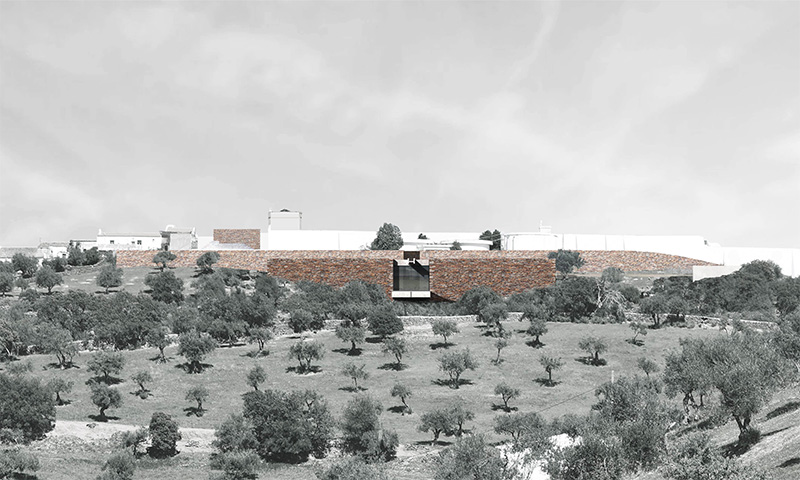
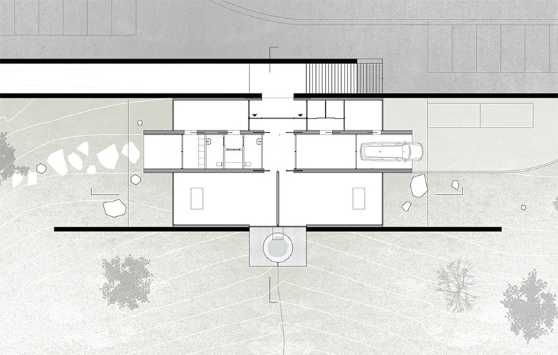
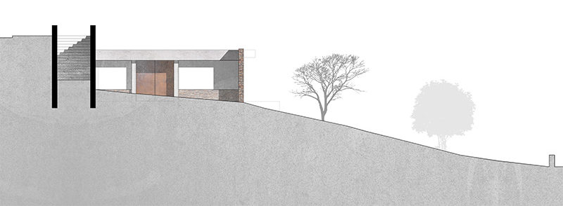
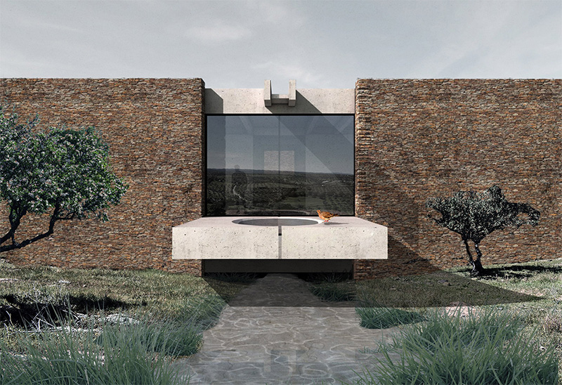
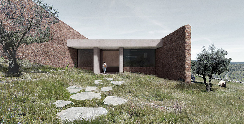
The urban intervention strategy of the Mortuary of Barrancos is focused on the design of the upper limit of main road, whichis one of the main access points to the village.
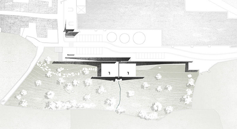
This sought to bring a new clarity and simplicity through the creation of a continuous line in shalewall.
The retaining wall of the new road appears as a starting point for the placement of the Mortuary of Barrancos.
This comes from a desire to frame the garden according to its great axis – the valley and the water line. The proposal does not seek more than to work with a truth that the land itself already holds, its function is only to highlight it and continue it.
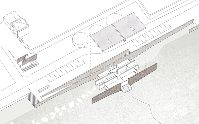
The program is then anchored and articulated by this great visual crossing, unfolding in a symmetrical way – the valley separates the user’s space from the technical space.
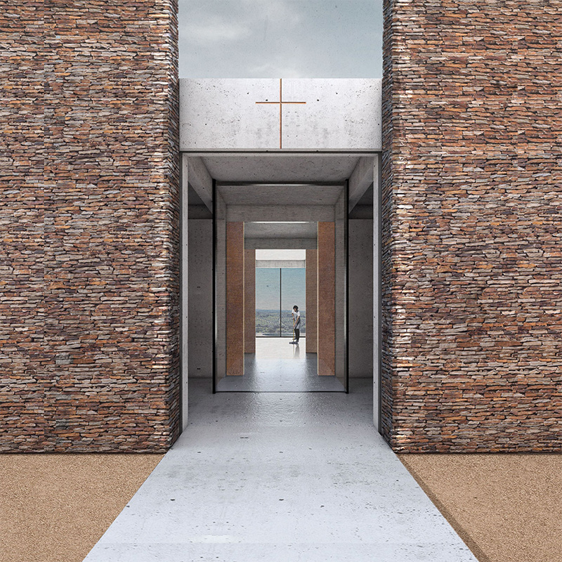
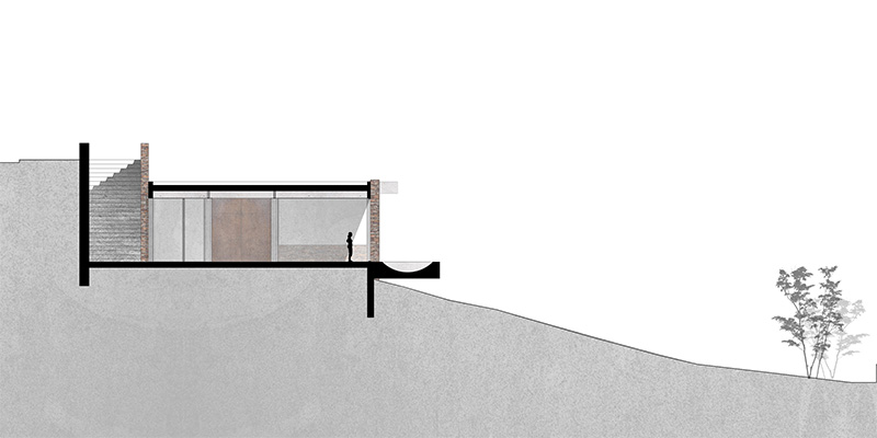
The entrance is made parallel to the new shale wall, in a descending path, culminating in the new great axial view. Finally, the two chapels appear as a large longitudinal nave topped by a new schist wall.
The entire spaces of the Casa Mortuária work in a longitudinal way, turning either to the west or to the east. Only circulation, the movement of crossing areas of the project, is done transversely.
This provision allows not only a clear reading and use of the Casa Mortuária, allowing different areas of the project to be closed when necessary, but also a more efficient circulation scheme.
The project expresses a tectonic appearance resulting from the constant dialogue between two different materialities.
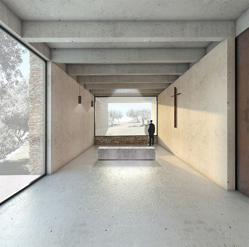
If, from the outside, shale appears as a physical manifestation of the project with all its noise and expression, inside it the apparent concrete takes center stage as the connecting element of the stone, in which it is embedded and as an evident structural entity of the building.
The result is a double wall composed of shale on the outside and concrete on the inside, with an air chamber capable of receiving insulation if necessary.
However, the interior walls are also double walls – in this case only concrete. This is due to the use of polished concrete as an interior finish – loading its spaces with a solemn character and reducing the cost of work and therefore the need for a route for all electrical and hydraulic infrastructures.
The sliding door system takes advantage of this solution, allowing that when opened, the project is nothing more than the symbiotic expression of the two materials described above.
The roof and floor slab repeat the concrete of the walls to accentuate the monolithic character of the tribute rooms, waiting rooms and the technician’s office, with a clarity that intends to mitigate the heavy nature of the funeral moment.
The concrete beams that support the roof slab run parallel to the huge spans fixed on the tops, give a cadence to the view that enters the sloping room and separate the ceiling from the walls emphasizing the three-and-a-half-meters
ceiling.
The large roof slab remains hidden by the two new walls, which enhances the project’s intention to be, above all, a landscape design rather than a building.
In the end, the intervention does not have the ambition to be more than a mark in the scenery – with the carachteristics and topography that it already has, drawn on a texture that has always
belonged to it

