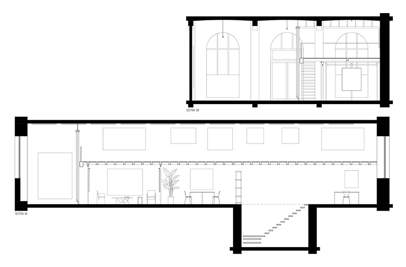
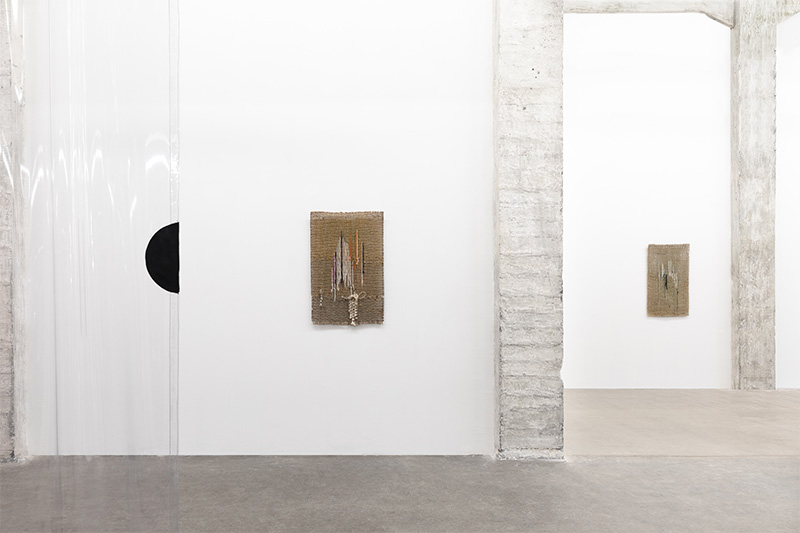
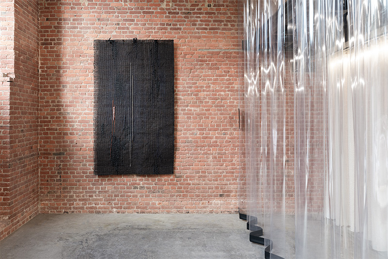
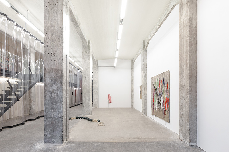
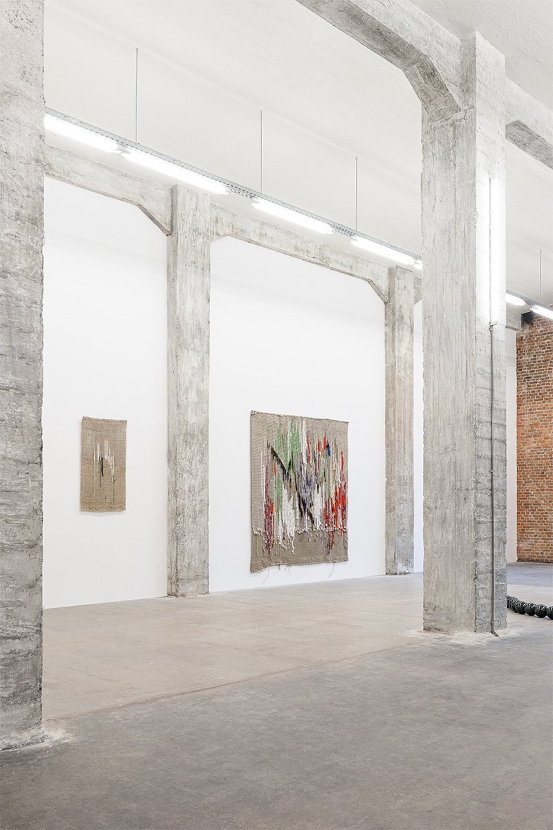
When asked to design the space for Obsidian Gallery, located within the historic Tour & Taxi building in Brussels, Belgium, the challenge became to create a dialogue between two exhibitions that would be hosted simultaneously, whilst keeping their own identity and relation to their physical space.
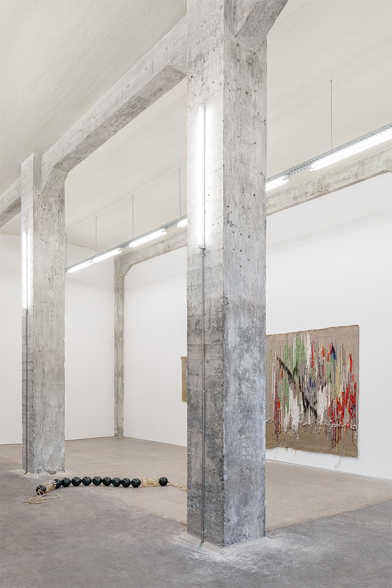
The strong presence of the building, a 19th century warehouse, and its architectural history was chosen to be respected by proposing scenographic opportunities for the exhibitions within the raw space, rather than a clean white space acting as a blank page.
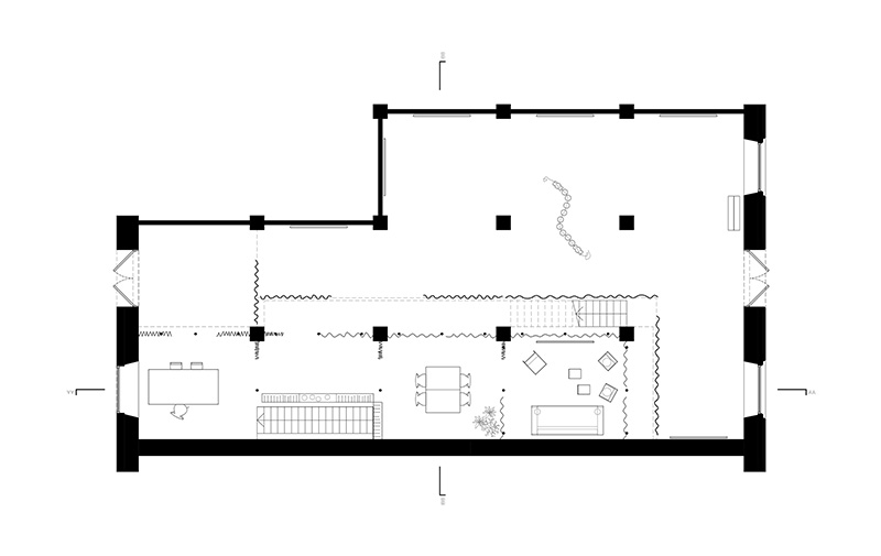
The Obsidian gallery has a very straightforward program: Two exhibition spaces, and “office” spaces. In a way, it was easy to define it into two categories: exhibition space vs office space. Yet we believe that every exhibition has to show its own identity through its own scenographic complexity.
Since the space was large and open, this created a challenge, to give both exhibition spaces enough appropriation, without ignoring the unity of the space as a whole.
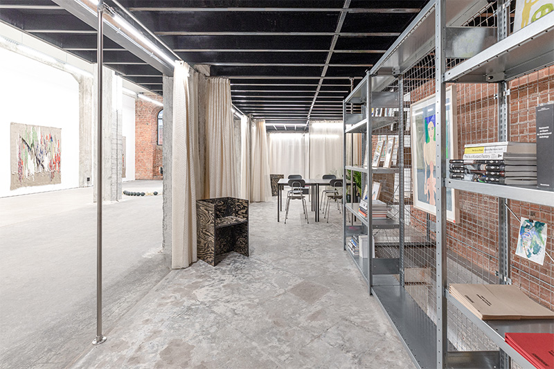
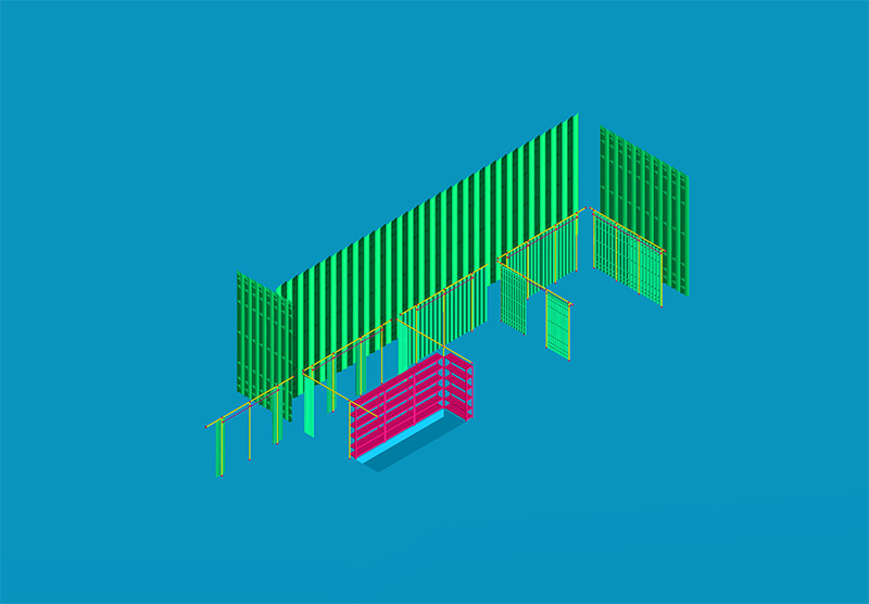
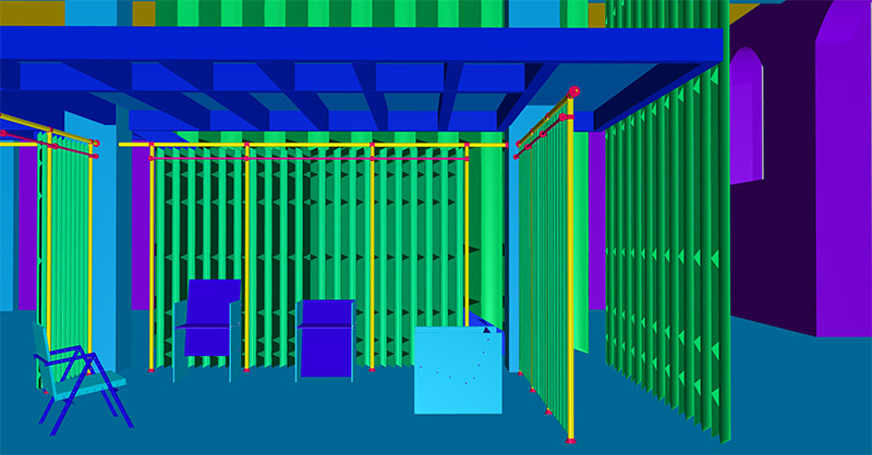
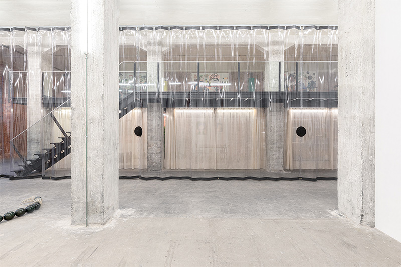
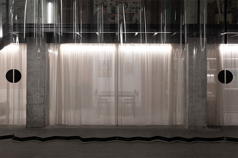
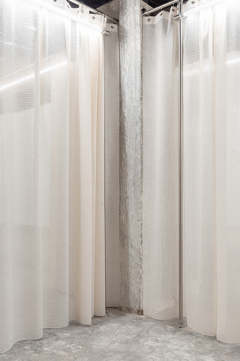
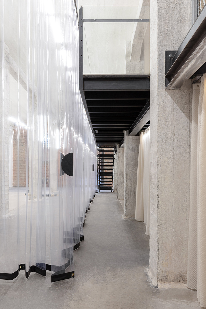
The office spaces, located under the mezzanine, were created through a set of stainless steel scaffolding structures.
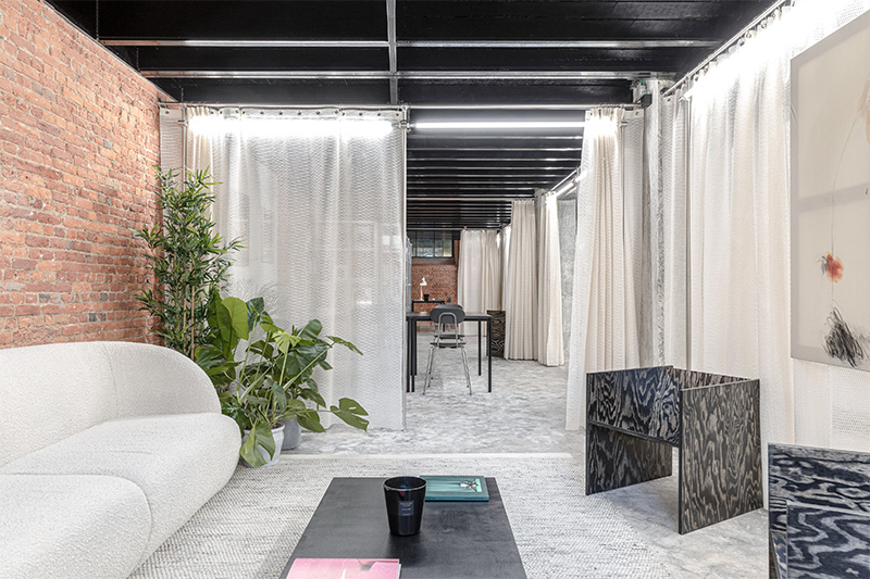
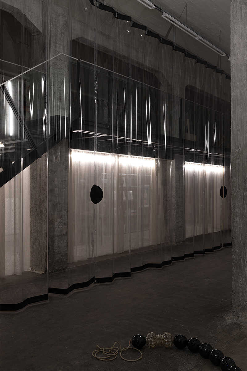
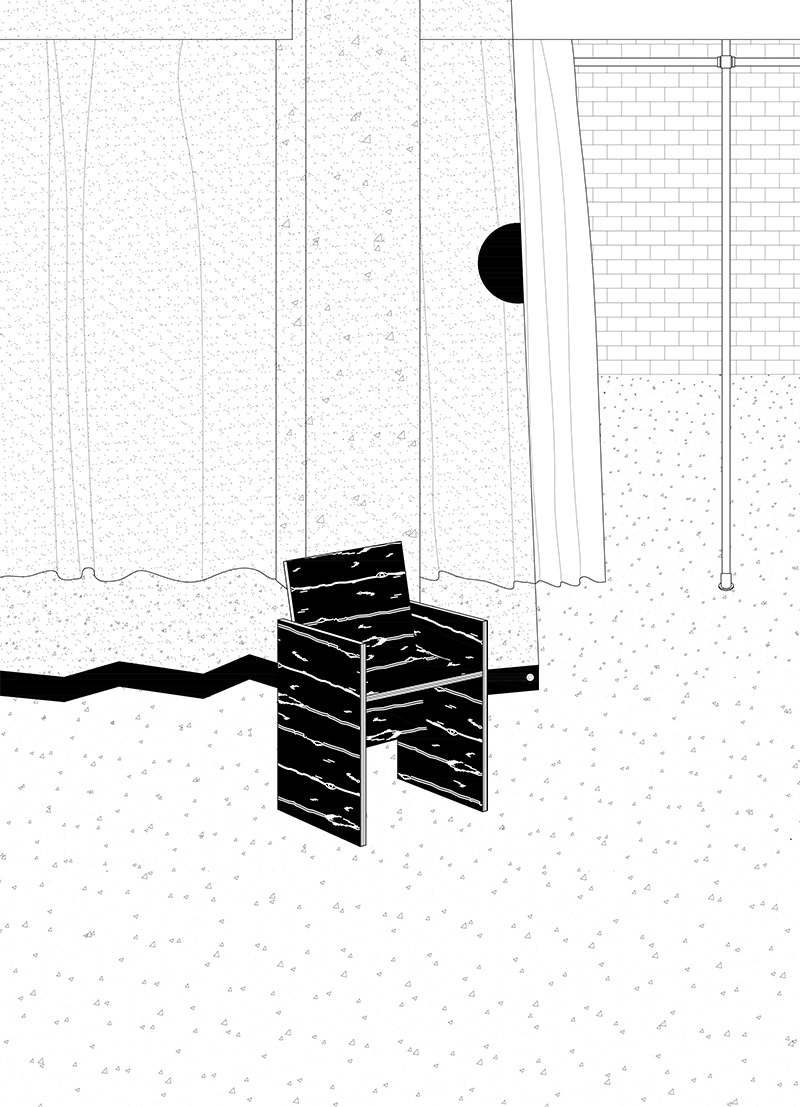
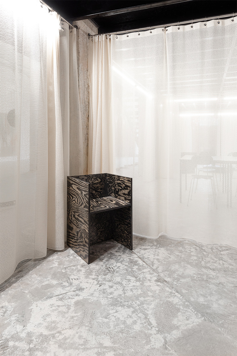
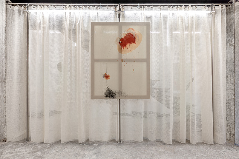
These structures hold up the curtains, house the lights and host art pieces through a hanging system. The repetition of these elements generated a series of consecutive rooms: an office, a gallery shop, a meeting room, and a living room.
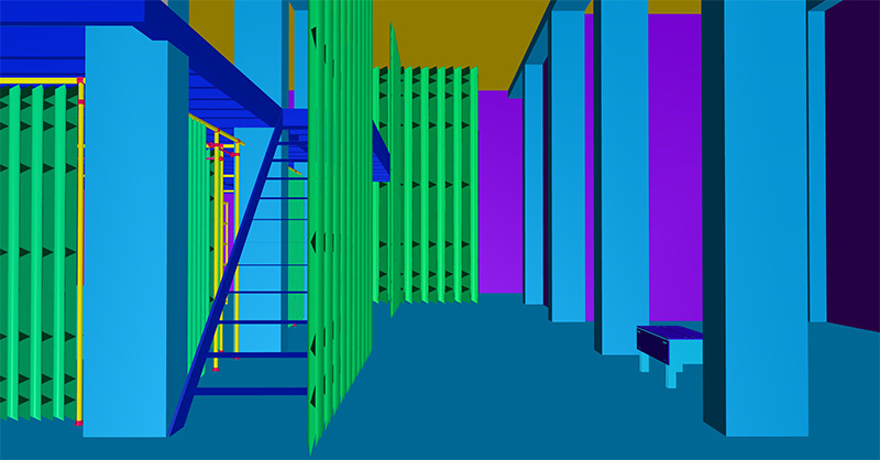
In order to define and enclose them we worked with domestic curtains, that would at the same time enable a continuous visibility between the rooms. With these curtains we created rooms, doors and hallways that were reinterpreted to answer to a need for dialogue and identity. The layout of the plan is rigid within this program of rooms, but it is the execution of them that changes their appropriation and modalities.
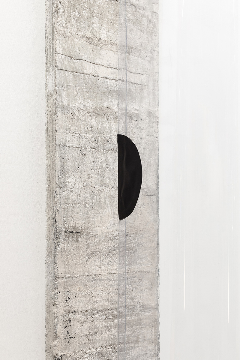
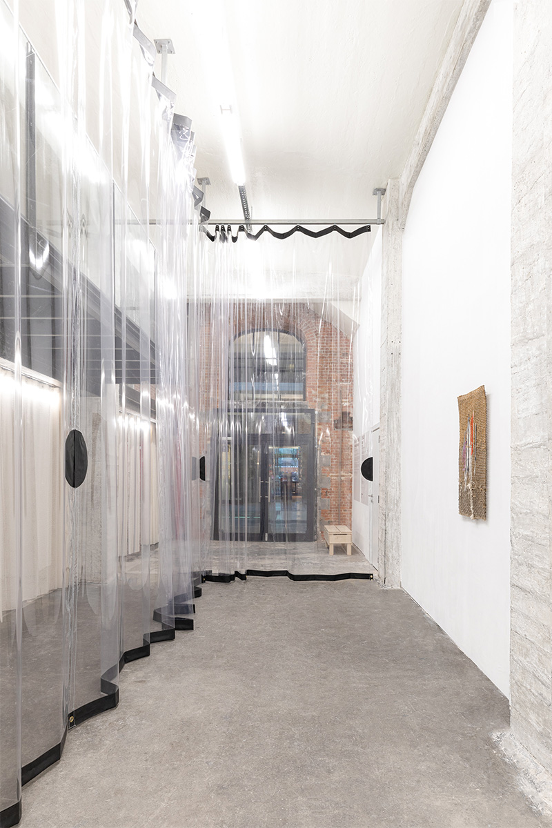
To address the industrial scale of the space, we introduced the use of a double height transparent heavy curtain, that would commonly be found in a factory to separate different activities, in this case it is not only a separator but also an integrator between the spaces. The transparent curtain acts as a glass facade to the mezzanine, keeping the two climates separate while maintaining a dialogue between them.
It is important for us to understand the range of possibilities that textile could introduce as a spacemaker. The design encourages the curtains to be moved around, creating different movement patterns and scenographic setups.
Curtains can create extra spaces, form flexible walls, change the acoustics and the entire atmosphere.
Therefore, an otherness is introduced, by the generous amount of material, scale and space, and there is no fear of transforming the space, since the intention is that every exhibition could adapt and transform the space to its needs

